
Feeling overwhelmed by endless paint swatches? I’ve been there. Staring at those tiny squares, trying to decide what’s right for your yard, can feel like torture.
You’re not alone.
Choosing the right outdoor colors shouldn’t be a guessing game. this guide comes in. I’m passionate about creating beautiful outdoor spaces (and helping you do the same). We’ll walk through a simple, step-by-step method to choose colors that speak to your unique style and space.
No more second-guessing. By the end of this article, you’ll have a personalized plan to craft a cohesive, inviting outdoor ambiance. It will feel like a true extension of your home.
Trust me, you’ll be sipping lemonade in your newly transformed yard in no time. Let’s get started!
First, Let’s Talk Feelings: The Psychology of Outdoor Colors
Choosing the right outdoor colors isn’t just about making things match. It’s about creating a mood. Blues and greens, for instance, are perfect for a chill spot.
They make you feel calm and connected to nature. Imagine a quiet afternoon with a book (or your favorite podcast) surrounded by these colors. It’s like a mini-vacation in your backyard.
Earth tones like browns and terracottas? They ground a space. These colors make everything feel warm and welcoming.
It’s like having a hug from Mother Earth. Perfect for patios where you want to unwind with friends or a good cup of coffee.
Now, if you’re all about energy and socializing, reds, oranges, and yellows are your go-to. They’re lively and bring excitement to any gathering. Think of them as the life of the party.
Great for areas where you host barbecues or game nights.
Neutrals such as grays, whites, and blacks provide a sophisticated foundation. They let your landscaping and accent colors pop. Want to make a statement?
Use these as a backdrop and let your creativity shine.
And hey, ever thought about incorporating water features yards? It’s an excellent way to raise your outdoor space.
Look Around: Inspiration in Your Home & Nature
Finding the right outdoor colors that blend with your surroundings isn’t just about picking favorites. It’s like asking, does your home fight with its environment?
Start with what’s fixed in your home. The roof, brick or stone, siding, window trim (these) aren’t changing often. They should be the starting point for your color palette.
Don’t ignore what you’ve already got.
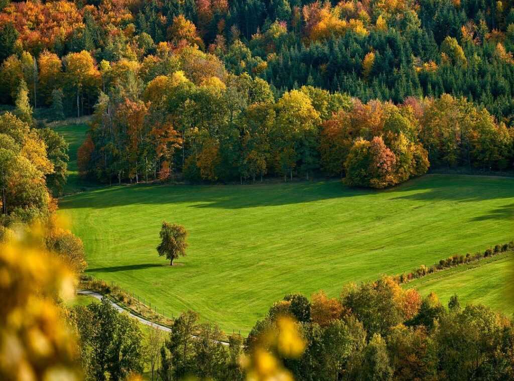
Then, turn your eyes to nature. The space right outside your window can be a goldmine of inspiration. Lush and green, arid and sandy, rich in flowers (whatever) you’ve got, use it.
Pull colors from trees, flowers, and terrain. Don’t just copy, integrate it. Seamlessly.
Let’s not forget about regional light. It’s huge. In the South, you’ve got bright, direct sun (it’s constant).
You can push those colors to be more saturated and bright. Up North, the light’s softer. Colors need depth to stand out.
Have you noticed how light shifts everything? It’s worth thinking about.
If you’re feeling stuck, just look outside. Nature rarely gets it wrong. The color combinations work because they’re meant to be together.
It’s like that perfect soundtrack in a movie (you know the one). Everything just clicks.
Remember, the best choices aren’t always the boldest. They fit. You’ve got the canvas (now) you’re ready to paint.
Want something to last? Go for colors that blend, not fight. This isn’t about making statements.
It’s about making something that feels like it belongs.
Right Outdoor Colors: Get Inspired
to some outdoor palettes that’ll make your yard pop. First up, the Coastal Retreat. Think sandy whites, soft sky blues, and sea-glass greens.
It’s like bringing a beach vibe into your backyard. Pair these colors with light-colored wood finishes and simple textiles. You’ll feel like you’re on vacation every day.
Trust me, the tranquility is worth it.
Next, let’s talk about the Modern Minimalist. This is for those who love clean lines and a sleek look. Charcoal gray, crisp white, and black form the core.
Add a single bold accent. Maybe a lime green door or bright yellow planters. The pop is bold, striking (and honestly, that’s the point).
Now, for a touch of nature, consider the Rustic Woodland. Deep browns, slate grays, and muted forest greens are key here. Materials like dark-stained wood, stone, and wrought iron complete the look.
It’s eye-catching without being over-the-top.
You’ll feel like you’re in a forested retreat right at home. It’s cozy and inviting (just how outdoor spaces should feel).
Finally, the Cheerful Garden is all about vibrancy. Colors like coral, turquoise, and sunny yellow shine here. Balance these with a neutral base on furniture to avoid overwhelm.
Your space will feel lively yet grounded. And why shouldn’t your outdoor space make you smile?
Pro tip: Consider how you layer outdoor lighting like pro to boost each palette. Light changes everything. So choose the right outdoor colors wisely!
They can transform your yard into a personal haven.
Painting Your Outdoor World: The Art of Color
Picking the right outdoor colors is like choosing the perfect outfit for your yard. You want balance, harmony, and a touch of flair. So, let’s break it down using the 60-30-10 rule.

Trust me, it’s simpler than it sounds.
Start with the main color (60%). This should cover your largest surfaces (think) siding, decks, or patio pavers. Go for neutral or natural shades.
They offer a clean backdrop and make everything else pop. It’s like wearing your favorite jeans. Comfortable and goes with anything.
Next, we move to the secondary color (30%). Here, you’re looking at larger furniture, pergolas, or fences. These should complement your main color.
Picture this as the shirt in your outfit. It works in harmony with those jeans.
Finally, the accent color (10%). This is where you get to have fun! Bold, bright colors for pillows, outdoor rugs, planters, and front doors.
These are easy and cheap to swap out as the seasons change. It’s like adding a splash of personality with a statement necklace or a colorful scarf.
For more inspiration on selecting the right outdoor colors, take a peek at what the experts suggest. Get creative!
The Final Step: Test Colors Like a Pro
Let’s talk about nailing the right outdoor colors. Before you go wild with gallons of paint, trust me, you need to test. Buy a few sample pots.
Paint big swatches. I’m talking at least 2×2 feet (on) the actual surface you’re planning to cover. Why?
Because color changes at different times of the day.
Take a good look in the morning sun, the glare of midday, and the evening glow. It’s like three different colors in one can. Compare your swatches to fixed elements like brickwork or roofing.
You don’t want your porch to clash with your roof, right?
Pro tip: Live with these swatches for a few days. Your eye needs time to adjust. It’s not a race.
You can decide when you’re ready, and your walls aren’t going anywhere. Go slow, enjoy the process, and make sure you love it.
Craft Your Perfect Sanctuary
Choosing the right outdoor colors can be overwhelming. But don’t worry. You’ve got this!
You’ve taken the leap and moved past that initial confusion. Remember, color paralysis is real, but you’ve learned a simple approach. Consider the mood, your home’s features, and proper testing.
You’ve got the tools now to transform your outdoor space into something personal and beautiful.
Ready for the next step? Dive into our decor and ambiance solutions. Bring your vision to life with the perfect pieces.
Need proof? We’re the #1 rated source for outdoor design solutions. Don’t wait.
Explore now!

 Heathiny Anderson is the kind of writer who genuinely cannot publish something without checking it twice. Maybe three times. They came to home styling techniques through years of hands-on work rather than theory, which means the things they writes about — Home Styling Techniques, Outdoor Ambiance Designs, Highlight Hub, among other areas — are things they has actually tested, questioned, and revised opinions on more than once.
That shows in the work. Heathiny's pieces tend to go a level deeper than most. Not in a way that becomes unreadable, but in a way that makes you realize you'd been missing something important. They has a habit of finding the detail that everybody else glosses over and making it the center of the story — which sounds simple, but takes a rare combination of curiosity and patience to pull off consistently. The writing never feels rushed. It feels like someone who sat with the subject long enough to actually understand it.
Outside of specific topics, what Heathiny cares about most is whether the reader walks away with something useful. Not impressed. Not entertained. Useful. That's a harder bar to clear than it sounds, and they clears it more often than not — which is why readers tend to remember Heathiny's articles long after they've forgotten the headline.